Regardless of your design program, you’re likely faced with a myriad of fonts to select from when you’re creating a design. But how do you choose fonts? What types of fonts go with what kind of designs? How can you manipulate text and fonts to create appealing visuals? Read on for the answers to this and much more!
What is a Font?
A font is simply a design for a set of characters. Sometimes incorrectly used as a synonym for typeface, fonts are actually combinations of typeface and other characteristics such as size and spacing.
The word typeface actually refers to the shape of each letter.Times New Roman, for example, is not a font. It is a typeface. However, within that typeface there are many fonts to select from, such as bold or italic.
Fonts are broken into two general categories – Serif and Sans Serif. Serif fonts have “feet” at the bottom of letters – see the example below: Times New Roman – this font has serifs at the end of some letters. Serifs are like little “feet” or anchors at the bottom of certain letters like T, and M. Arial is a Sans Serif font – there are no serifs or “feet” on letters of this font.
Tips for using Fonts Effectively:
Choose a font that is suitable for your audience. For example, if you’re creating an award for a local travel agency, it is a good idea to stick to simple fonts; however a flower shop or children’s store may warrant a more light-hearted font such as Comic Sans. There are some fundamental principles to use when determining which fonts you want to work with. We recommend sticking to two or three fonts in your design – you don’t want it to appear flat, but you also don’t want the design to look too busy. Think about using fonts from the same family. Family refers to a set of fonts with the same typeface (shape), but with differing slants, weights and sizes. This way, they may appear to look different, but they will still share the same basic design elements. For the most part, when dealing with fonts, the more simplistic the design the better. There are a few small tricks you can use to create a more dramatic look for any award including: Drop cap the first letter in a series. This will give text a sophisticated look and help it stand out. The term "Drop Cap" simply means to make the first letter in a series larger than the rest.
DON’T GO CAPITAL CRAZY. Sure, the message is important, but all caps appear to be shouting at the reader. Depending on your design, you may find lower case letters are not only cleaner, but utilizing them between the important phrases will help readers pay attention to the main point – the award and the recipient.
Change your direction. When appropriate, there’s nothing wrong with using both horizontal and vertical text within an award design – it creates a sort of cross-word effect and looks charming when your intersection point is the same letter.
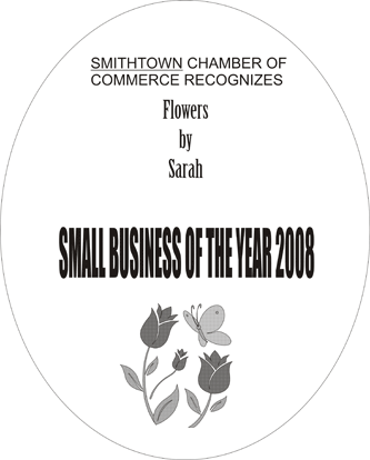
Take a look at the design to the below, created for a flower shop. While it serves the purpose of announcing the award, the fonts and layout are not eye-catching. The fonts do not relate to the recipient or award presenter. All items are centered, which creates a flat and unsophisticated look.

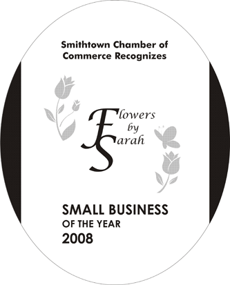
Now take a look at the same award arranged in a different way. The same elements are still there, but the award looks much more appealing. It is more suited to the audience and has a better sense of flow. Just by using the simple techniques listed above, we’ve created a much better award design.

Below is a list of the most popular San Serif and Serif Fonts. These provide great examples of where to start for creating visually appealing typography:
Lasers are increasingly being used for their ability to create intricate cuts on a wide variety of materials.
The highly accurate precision cut of a laser provides you with great consistency and control. Additionally, laser cutting material results in perfectly seared edges to prevent fabric from unraveling. Increased speed and higher cutter throughput, coupled with automated and computer-controlled cutting ability allows for an extremely small cut width and precise, detailed work.
The felt holiday bag appliqué below was cut using a 35-watt Mini 18, while dragon appliqué was created on a Helix and is cut from sticky-back two-ply twill. Utilizing the laser's color mapping feature you can set the various vector line to either cut through both lasers of fabric or just kiss-cut the fabric to show the color underneath. After you have cut the fabric you can heat press the appliqué, or convert the file to stitch it on a garment.
San Serif:
1. Helvetica
2. Univers
3. Frutiger
4. Futura
5. Franklin Gothic
6. Optima
7. Gill Sans
8. Akzidenz-Grotesk
9. Avant Garde
10. Myriad
Serif:
1. Garamond
2. Caslon
3. Baskerville
4. Bodoni
5. Goudy
6. Times
7. Century
8. Palatino
9. Sabon
10. Stone Serif
With such an array of fonts to choose from, you may be overwhelmed with the selection. However, if you experiment with different looks and styles, you’ll quickly learn which fonts work the best for different projects. While there are exceptions to every rule, the tips and techniques listed above will help you on your way to selecting the correct font for all of your laser engraving projects.